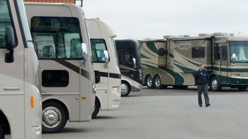
Three years ago, right before the 2016 elections, I embarked on a road trip from New York City to southern California, cramming as many national parks and campgrounds as I could into two months, at times sleeping in the back of my car with my dog in truck stop parking lots. As you might imagine, this involved spending a lot of time traveling on America’s interstate highway system, where, as I passed RV after RV plastered with what resembled tribal tattoo decals or in some extreme cases, flames, I found myself obsessed by the question—why are so many RVs so fucking hideous? And why, despite this, do I desperately want one?
I’m not talking about a classic stainless steel Airstream, or an RV from the ’70s or ’80s whose main design element is a nice, simple stripe or two, or purveyors of the #vanlife. I’m talking about today’s monster motorhomes plastered with what the industry euphemistically describes as “swoops and swirls” and what I think of as the unfortunate spawn of Guy Fieri fucking a school bus. The kind of RVs that are the province of people who have $200,000 to spare and who want the freedom to see the beauty of America but in the tackiest, most gas-hungry, and sanitized method possible.
Advertisement
It turns out, I’m not the only person who has ever wondered about the aesthetic choices of RV manufacturers. Search the question, “Why are RVs so ugly,” and you’ll find there is a world of RV owners who hate how they look. It is a look that one blogger, the owner of an Airstream, has dubbed the “Energy Drink Aesthetic.” One commenter on cheaprvliving.com blamed the style on the “RV Exterior Vinyl Industrial Complex,” which I wholeheartedly believe, but still left me unsatisfied.
Could I find some answers?
To start my hunt, I reached out to Al Hesselbart, the former historian at the RV Museum and Hall of Fame in Elkhart, Indiana, the city that bills itself as the “RV Capital of the World.” (It’s estimated that more than 80 percent of all RVs built in the world are manufactured in or around the town of 50,000.) Hesselbart is the author of not one but two books on the history of RVs, a Robert Caro if you will of the recreational motorhome, regularly interviewed and cited on websites like RVBusiness.com and the RV Family Travel Atlas. In short, if anyone would know the answer to my question, it would be Hesselbart.
Advertisement
“I have never been sure,” Hesselbart told me when I reached him by phone and asked him why RVs are so fucking ugly these days. He added, to underscore his point, “I don’t understand.”
Hesselbart retired from his job at the RV Museum and Hall of Fame in 2014 and now lives full-time in an RV park in Florida with “150 neighbors.” His RV of choice is a 40-year-old Newell motorhome that he described as “classically styled”—a sophisticated navy blue on top and a silver bottom, with a teal, silver, and navy pinstriped middle. And while he didn’t say he hates the look of today’s RVs in so many words, he hates the look of today’s RVs. “I have personal prejudice, I guess, in that I am not a fan of the modern squiggles and curlicues designed for the decor,” Hesselbart told me diplomatically in his slow drawl. “And the fact that they have all gone to very similar squiggles and swirls, the modern buses in my opinion have no personality.”
Advertisement
For a time in the ’90s, Hesselbart told me, the fad was to airbrush a mural on your RV. “There were some world-famous airbrush artists who did really remarkable scenes, all kinds of things on RVs,” he recalled fondly. That fad went away, and he noticed that beginning in the late ’90s and early 2000s, the new trend became “swirls and swiggles.” “I don’t know if it’s what people wanted, or I guess what was available,” Hesselbart said. I detected a strong note of resignation in his voice. It was clearly a topic that wearied him. “I don’t know if anybody did research and sat down and surveyed 10,000 RVers to say, what should your RV look like? Just all of a sudden, a few manufacturers put swirls and squiggles.”
I thanked Hesselbart for his time, he encouraged me to buy an RV one day, and I told Hesselbart that buying an RV was my fondest wish. Our interview, while illuminating—the world’s foremost historian on RVs also was perplexed by the rise of the ugly RV!—was ultimately frustrating, as it provided no definitive answers. Because I appreciate a challenge and also because at this point I had invested too much time to not continue, I trucked (haha) on.
Advertisement
I next spoke with Chris Barth, the Senior Director of Product Development at the RV manufacturer Jayco and a long-time RV designer. I anticipated it would be a hostile interview, given that Jayco’s RVs often look like this:

Advertisement
You can imagine my surprise when Barth told me, “Nobody understands the swooshes and the sweeps on the outside. And we’ve seen a lot of people asking, like, why do you guys do it that way? It’s funny because we talk about this in meetings as well. That’s the way we’ve always done it.”
Do the swooshes and sweeps serve any sort of practical purpose, I asked him? In a word, no. “I wish there were some really good reasons,” Barth said. He continued: “The graphics serve no functional purpose except breaking up the big giant wall of the coach,” and noted that a completely undecorated RV—what he called a “snowball”—is “rather ugly.” “So you kind of want to break it up a little bit,” Barth said. “I would admit you wholeheartedly that we don’t always do that really well. It still, to someone like you”—I can only assume he meant a person with functioning eyes—“I’m sure all looks a little ridiculous.”
Advertisement
Barth, who got his start in the industry working for his dad’s RV design company, remembered that in the mid-90s, it was still all about the stripe. But then, he said, “We got into what was called nonlinear graphics, and everybody got super excited about that. And then the RV industry kind of stuck there for almost 20 years.”
He added, “It’s not a good excuse. But it’s what happened.”
But Jayco, along with other RV manufacturers, is slowly changing to meet customer tastes, Barth said. “I think if you look at the exteriors just in the last year or two, there are a lot of people who are doing linear stuff and try to make it look more like stripes.”
Advertisement
What took his company so long, I asked him? “There are a lot of like-minded folks doing the same thing, and maybe some people are a little scared of creativity or are worried about kind of going outside of the norm,” Barth told me, adding, “The community here is very conservative.” I assumed, as we were talking primarily about design, that he was referring to a sort of cultural conservatism resistant to any sort of change. But Barth quickly added, “We’re in a a predominantly red state zone here,” alluding, I believe, to the empirically bad taste of rich, old Republicans who I imaginemake up a sizable portion of the RV market. “Stacey [Jayco’s senior designer] and I are on a team of other designers, and we’re all trying to push more all the time,” Barth said. “But it’s a slow push.”
Change is slow, in all things. And I still fucking want an RV.


