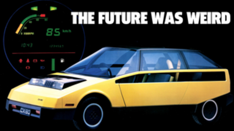
When it comes to auto design, it can often feel like all of the big ideas have already been explored, and that the world of design is, like the Earth, completely mapped and known. I’m not sure if that’s entirely true, as I believe there are still many undiscovered islands of design out there. Some, though, probably should remain uninhabited. I’m not sure how to escape this metaphor now, so I’ll just come out and say it: Toyota’s 1979 FCX-80 concept looked really, really weird.
The FCX-80 (also known as the CX-80) was shown at the 1979 Tokyo Motor Show, and was intended to be a vision of a future city car, one that would be light, spacious, and efficient. I think overall the concept actually achieved these goals, and the design had a lot of bold, novel decisions and some interesting ideas.
Advertisement
It’s just a shame that the result was so strangely ugly.
It’s confusing, because I do think this concept is cool, and there’s a lot about it I like, in individual ideas, but the overall whole just feels awkward and clumsy.

Take the centrally-mounted pod on the hood, for example. It houses headlights and air intakes for the car, and there’s no question it’s a very original idea. I can’t think of any production car that has used such a design. And I think the FCX-80 is proof of why.
Advertisement
I admire the asymmetry, the crispness, the unashamed machine-like qualities of it, I just can’t say it actually works. It feels like an awkward robotic duck with an underbite.

Advertisement

I like the side window treatment, too, the way the windows appear to break through the beltline and get revealed in a separate slash down the side of the car. I like the idea on paper, but I just can’t say it’s actually working.
Advertisement
The angular body could be cool, but it’s more just awkward. The extra angle in the windshield is interesting and bold and makes everything look and feel sort of off, as does the angled beltline and and the door cutlines, and, well, just about every angle in the car.
The interior is remarkably ‘80s for a car designed in the late 1970s. Those tubes that make up the structure of the seats with those rubber accordion boots—it’s all just perfect and terrible and wonderful at the same time. It’s confusing.
Advertisement

That totally flat floor really makes the interior feel open and airy, and I like the rows of illuminated buttons/warning lights on that instrument binnacle. The seats look like gym equipment and that carpet looks like hell to vacuum potato chip fragments out of, but overall I think the interior may be the most successful part of the car.
Advertisement

This is also odd—look at how there appears to be taillights on the tailgate itself, and behind them, on the main body of the car. What’s going on there? Is this one of those cases of duplicated taillights for when the hatch is open? Are the ones on the tailgate real lights or just windows? I’m curious.
Advertisement
As much as I’m maligning this largely-forgotten concept, I still can’t help but admire how little it has in common with the way auto design developed. This represents an entire, unexplored path, for better or worse, and that in itself is something interesting.
The Toyota FCX-80: the car that looks like an old modem sounds.


