Did you notice a recent change to how Google search results are displayed on the desktop?
I noticed something last week — thinking there must be some kind of weird bug messing up the browser’s page rendering because suddenly everything looked similar: A homogenous sea of blue text links and favicons that, on such a large expanse of screen, come across as one block of background noise.
I found myself clicking on an ad link — rather than the organic search result I was looking for.
Here, for example, are the top two results for a Google search for flight search engine ‘Kayak’ — with just a tiny ‘Ad’ label to distinguish the click that will make Google money from the click that won’t…
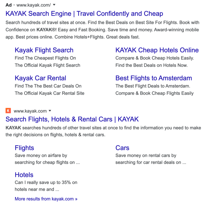
Turns out this is Google’s latest dark pattern: The adtech giant has made organic results even more closely resemble the ads it serves against keyword searches, as writer Craig Mod was quick to highlight in a tweet this week.
There’s something strange about the recent design change to google search results, favicons and extra header text: they all look like ads, which is perhaps the point? pic.twitter.com/TlIvegRct1
— Craig Mod (@craigmod) January 21, 2020
Last week, in its own breezy tweet, Google sought to spin the shift as quite the opposite — saying the “new look” presents “site domain names and brand icons prominently, along with a bolded ‘Ad’ label for ads”:
Last year, our search results on mobile gained a new look. That’s now rolling out to desktop results this week, presenting site domain names and brand icons prominently, along with a bolded “Ad” label for ads. Here’s a mockup: pic.twitter.com/aM9UAbSKtv
— Google SearchLiaison (@searchliaison) January 13, 2020
But Google’s explainer is almost a dark pattern in itself.
If you read the text quickly you’d likely come away with the impression that it has made organic search results easier to spot since it’s claiming components of these results now appear more “prominently” in results.
Yet, read it again, and Google is essentially admitting that a parallel emphasis is being placed — one which, when you actually look at the thing, has the effect of flattening the visual distinction between organic search results (which consumers are looking for) and ads (which Google monetizes).
Another eagle-eyed user Twitter, going by the name Luca Masters, chipped into the discussion generated by Mod’s tweet — to point out that the tech giant is “finally coming at this from the other direction”.
They’re finally coming at this from the other direction:https://t.co/XYkHjVrE8X
— Luca K. B. Masters (@lkbm) January 21, 2020
‘This’ being deceptive changes to ad labelling; and ‘other direction’ being a reference to how now it’s organic search results being visually tweaked to shrink their difference vs ads.
Google previously laid the groundwork for this latest visual trickery by spending earlier years amending the look of ads to bring them closer in line with the steadfast, cleaner appearance of genuine search results.
Except now it’s fiddling with those too. Hence ‘other direction’.
Masters helpfully quote-tweeted this vintage tweet (from 2016), by journalist Ginny Marvin — which presents a visual history of Google ad labelling in search results that’s aptly titled “color fade”; a reference to the gradual demise of the color-shaded box Google used to apply to clearly distinguish ads in search results.
Those days are long gone now, though.
Color fade: A history of Google ad labeling in search results https://t.co/guo3jc4kwzpic.twitter.com/LMYqhmgfyE
— Ginny Marvin (@GinnyMarvin) July 25, 2016
Now a user of Google’s search engine has — essentially — only a favicon between them and an unintended ad click. Squint or you’ll click it.
This visual trickery may be fractionally less confusing in a small screen mobile environment — where Google debuted the change last year. But on a desktop screen these favicons are truly minuscule. And where to click to get actual information starts to feel like a total lottery.
A lottery that’s being stacked in Google’s favor because confused users are likely to end up clicking more ad links than they otherwise would, meaning it cashes in at the expense of web users’ time and energy.
Back in May, when Google pushed this change on mobile users, it touted the tweaks as a way for sites to showcase their own branding, instead of looking like every other blue link on a search result page. But it did so while simultaneously erasing a box-out that it had previously displayed around the label ‘Ad’ to make it stand out.
That made it “harder to differentiate ads and search results,” as we wrote then — predicting it will “likely lead to outcry”.
There were certainly complaints. And there will likely be more now — given the visual flattening of the gap between ad clicks and organic links looks even more confusing for users of Google search on desktop. (Albeit, the slow drip of design change updates also works against mass user outcry.)
We reached out to Google to ask for a response to the latest criticism that the new design for search results makes it almost impossible to distinguish between organic results and ads. But the company ignored repeat requests for comment.
Of course it’s true that plenty of UX design changes face backlash, especially early on. Change in the digital realm is rarely instantly popular. It’s usually more ‘slow burn’ acceptance.
But there’s no consumer-friendly logic to this one. (And the slow burn going on here involves the user being cast in the role of the metaphorical frog.)
Instead, Google is just making it harder for web users to click on the page they’re actually looking for — because, from a revenue-generating perspective, it prefers them to click an ad.
It’s the visual equivalent of a supermarket putting a similarly packaged own-brand right next to some fancy branded shampoo on the shelf — in the hopes a rushed shopper will pluck the wrong one. (Real life dark patterns are indeed a thing.)
It’s also a handy illustration of quite how far away from the user Google’s priorities have shifted, and continue to drift.
“When Google introduced ads, they were clearly marked with a label and a brightly tinted box,” said UX specialist Harry Brignull. “This was in stark contrast to all the other search engines at the time, who were trying to blend paid listings in amongst the organic ones, in an effort to drive clicks and revenue. In those days, Google came across as the most honest search engine on the planet.”
Brignull is well qualified to comment on dark patterns — having been calling out deceptive design since 2010 when he founded darkpatterns.org.
“I first learned about Google in the late 1990s. In those days you learned about the web by reading print magazines, which is charmingly quaint to look back on. I picked up a copy of Wired Magazine and there it was – a sidebar talking about a new search engine called ‘Google’,” he recalled. “Google was amazing. In an era of portals, flash banners and link directories, it went in the opposite direction. It didn’t care about the daft games the other search engines were playing. It didn’t even seem to acknowledge they existed. It didn’t even seem to want to be a business. It was a feat of engineering, and it felt like a public utility.
“The original Google homepage was recognised a guiding light of purism in digital design. Search was provided by an unstyled text field and button. There was nothing else on the homepage. Just the logo. Search results were near-instant and they were just a page of links and summaries – perfection with nothing to add or take away. The back-propagation algorithm they introduced had never been used to index the web before, and it instantly left the competition in the dust. It was proof that engineers could disrupt the rules of the web without needing any suit-wearing executives. Strip out all the crap. Do one thing and do it well.”
“As Google’s ambitions changed, the tinted box started to fade. It’s completely gone now,” Brignull added.
The one thing Google very clearly wants to do well now is serve more ads. It’s chosen to do that deceptively, by steadily — and consistently — degrading the user experience. So a far cry from “public utility”.
And that user-friendly Google of old? Yep, also completely gone.


