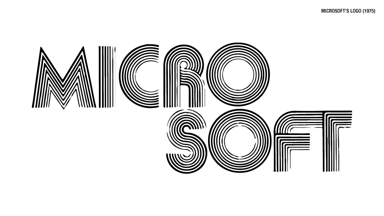
 And as Microsoft entered the 1980s, you could see where the company was heading.If the 1975 logo was a product of its age, so was the 1980s version. As computers began to enter common usage in the home, there seemed to be a love affair with fonts that seemed to mimic Star Wars loosely. Microsoft was not immune from this trend.The second logo didn’t last too long, however as in 1982 one of the most famous Microsoft logos made its debut.In 1982 Microsoft introduced a simpler logo with the exception of a specialized “O” in the center that came to be known as ‘blibbet.’When yet another logo change was announced for 1987, Microsoft employees tried to save the blibbet but were unsuccessful.The 1987 logo is probably the best known for the company as it finally didn’t follow modern design trends that would rapidly date it. This one ended up lasting the longest and will probably be the one people think of for years to come.As 2012 rolled around, Microsoft decided that 25 years with the same logo was long enough.In 2012 Microsoft introduced a simplified font that is a product of current design trends, but is so simple that it shouldn’t date it too horribly going into the future.
What does a logo say about a company? Actually quite a bit, and that’s why companies spend millions of dollars on redesigning them from time to time. A poor redesign can have cause such a negative reaction from the public that sales can dip. Just ask The Gap.
Microsoft has had numerous logos over its nearly 40 year history, and and almost all of them has been very much a product of the time and design aesthetics popular in that era. Lets take a look through them from over the years with the gallery above.


