It’s been just over five months since Carl Pei first told the world about Nothing. Perhaps it’s just the way time moves these days or maybe it’s the fact that the company has trickled out information in the intervening months. Whatever the case, it feels like we’ve been waiting on today’s full Ear (1) reveal forever.
It’s been a pretty savvy strategy for a brand-new consumer hardware startup, building on the built-in buzz/anticipation from Pei’s connection to OnePlus. We’ve covered a number (but certainly not all) of the announcements between February and now and gotten most of the jokes about its name out of our system.

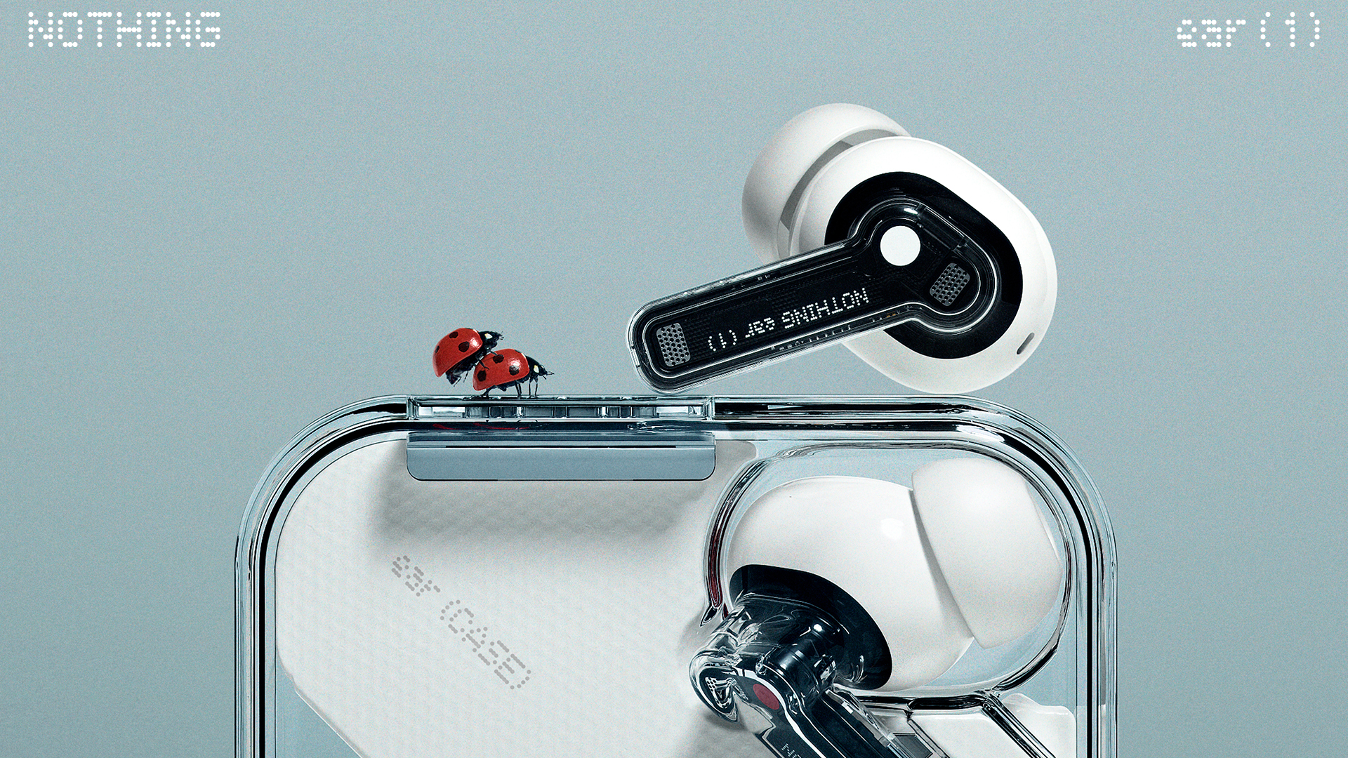
Image Credits: Nothing (Note the…friendly insect marketing theme).
Frankly, the sheer volume of news Nothing has released hasn’t left a lot to the imagination. Our interview with Pei revealed the pricing of the buds ($99 USD), along with their noise canceling. We recently caught an image of the transparent charging case and battery life (24 hours, all told, with the case and ANC turned on, 36 hours without) via a StockX auction. In fact, the only thing left to reveal was the buds themselves (a pretty big piece, admittedly).
In conversations I’ve had with Pei, the founder has emphasized aesthetics as a key differentiator. The message has, admittedly, been somewhat muddled by the imagery Nothing has chosen to release. The first image associated with the company and product was actually the silhouette of the device’s PCB (printed circuit board). The second was an early concept Pei said was inspired by his grandmother’s tobacco pipe.
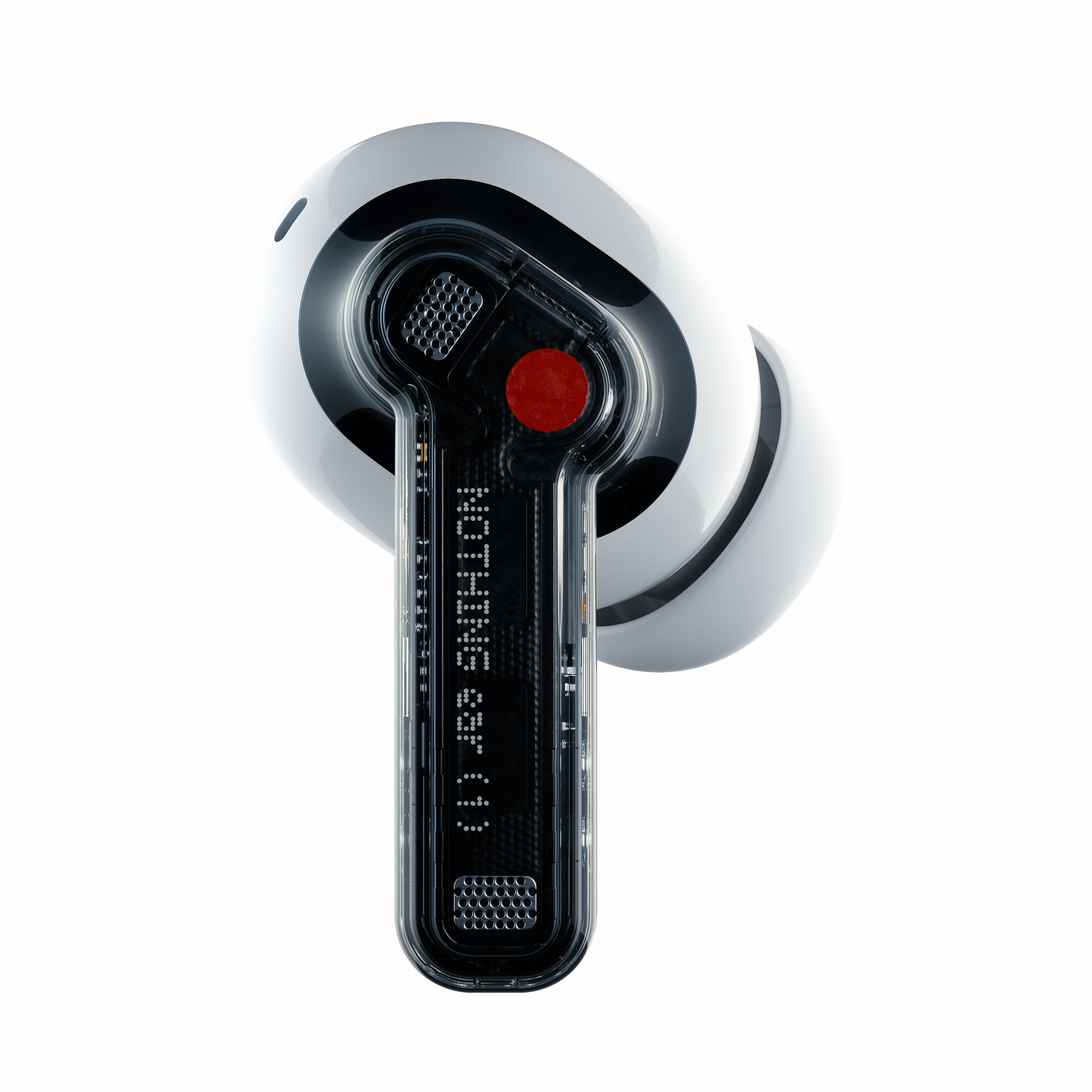
Image Credits: Nothing
It’s clear that Nothing was keen to highlight how much it iterated on this project before launch. In fact, Pei told me that such iterations were part of the reason the product’s original launch was pushed back by a few months. For one thing, the company wanted the Ear (1) to look distinct from anything else on the market. For another, there’s an added level of complications when making your gadget at least partially transparent. That means the insides — the components and the glue that gold them together — need to look as good as the outside.
One thing you can say almost immediately about the Ear (1): Nothing looks quite like them. From a form factor standpoint, they most closely resemble AirPods, with a long stem that drops down from the buds. The stems themselves feature the majority of the product’s transparency (putting aside the case for a moment). The bud segment is an opaque white, likely owing to the fact that the those insides are frankly more unsightly.
Each stem features a touch panel single color dot — red and white — to distinguish right from left. That’s a subtle nod to RCA cables, with red for right and white for left. Another nice aesthetic touch is the Nothing logo printed down the lengths of the stem. The dotted text is an homage to printing on circuit boards — it’s an aesthetic the company is using across its press material. Around the other side are two magnetic dots that connect to the charging pins in the case.
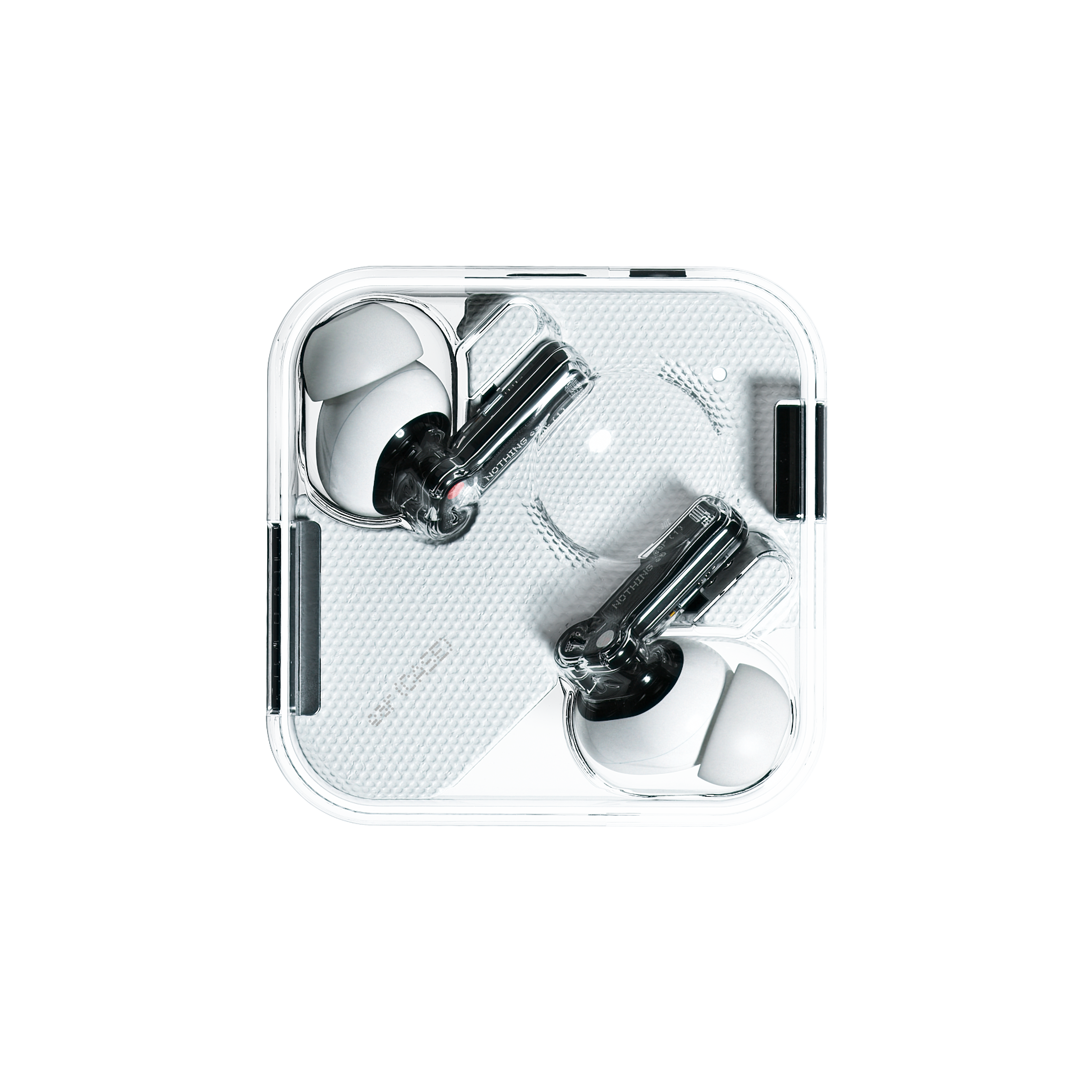
Image Credits: Nothing
The case is made of transparent plastic, with a pair of dots that keep the buds in place. A third, large concave circle further secures the case and doubles as a spot for your thumb while holding it. A white swath runs through the center of the case, again presumably covering up some unsightly electronics.
The buds themselves feature 11.6mm drivers and audio tuned by Teenage Engineering, which also served as the design team. There’s Bluetooth 5.2 onboard and a trio of listening modes: Active Nose Canceling, Light Mode and Active Transparency. Some other features worth, including a built-in chirp for locating lost buds via the app.
They go on sale July 31 for $99. Stay tuned for a review.

