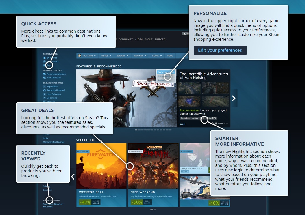
Valve’s rolled out a new update to the Steam store. Fire up your client or load their main page in your browser, and you’ll be met with a new interface.
The biggest things I’ve noticed? You’ll find a drop-down menu in the top right corner of every game, and you set preferences, ignore it or wishlist it right there. Each game also features a pop-up of screenshots when you hover over it. That’s handy.
The Steam store was updated for content discoverability
It’s hard to get noticed on Steam. Unless your game is selling like gangbusters or hyped like crazy, it’s more than likely not going to be noticed by most shoppers. Steam performs visual updates like this one to, of course, sell games.
Depending upon your choices and your friends, you might wind up playing some cool obscure titles. The Discovery Queue and Curators sections have all been retooled and have their own concise home. That’s great news for developers.
What do you think of the update?


