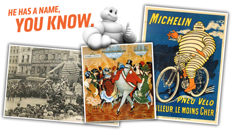
It was at the Detroit Auto Show earlier this month that I was confronted with a very sobering and ugly realization: I work with people who were not aware of the Michelin Man’s given name. These weren’t just some rubes off the street, people who don’t know a tire from a colossal licorice bagel with sipes and sidewalls, but people I respect who know cars in a deep, rich way. A quick informal survey showed me that they’re not alone—there’s many people out there unaware of how to address the Michelin Man should you find yourself next to him, on his sofa, sipping Cointreau. Let’s solve this. Now.
Ready? The Michelin Man’s given name is Bibendum. Our Vatican City readers will likely recognize that as the Latin verb for “drink,” because the very first ad with Bibendum, in 1898, portrays him as a plutocrat-looking gourmand, complete with pince-nez glasses and a big cigar, about to quaff a huge goblet full of broken glass, nails, and all sorts of sharp things.
Above this image reads the text “NUNC est bibendum,” which pretty much means, “now we drink.”
The implication here is that the tires that compose Bibendum, quality Michelin tires, are so tough they can just “drink up” all of the pointy, puncture-y hazards of the roads, unlike the miserable tire-people to either side of Bibendum, who have been reduced to deflated mounds of inferior rubber dinguses.
Advertisement
The original inspiration for Bibendum came in 1894 when Édouard and André Michelin saw a stack of tires that, somehow, reminded them of the figure of an armless man. Later, André Michelin met a cartoonist named O’Galop who had previously designed an ad for a German brewery that was basically the same format as the famous first Michelin ad there, but the rotund German beer-drinker was replaced with that ghoulish golem of tires.
Bibendum’s appearance has changed pretty dramatically over the years, and in his original form, was very much a product of his era. The details—the pince-nez and cigar—were once signifiers of status and success, and were dropped pretty early, as this animation from 1935 shows:
Tires of Bibendum’s birth era were very skinny and white, since this was in the pre-carbon black era of tires, so early Bibendi tended to have a quite different overall appearance.
Advertisement
And by “different,” mostly mean “terrifying.” Here’s a postcard of some 1920 Bibendum mascots, with pince-nez and cigars:
They’re worse with their heads on:
Advertisement
Still, Bibendum was always friendly, especially to motorists, as he was portrayed engaging in selfless acts like giving a stranded motorist one of his choicest midsection tires, which had to feel at least a little bit weird.
Over the years, like so many other mascots and cartoon characters, Bibendum went through a gradual and relentless process of cutification, or, perhaps more accurately, neotenization.
Advertisement
Neoteny is the a biological term that refers to the retention of juvenile features into adulthood—essentially, remaining cute.
Modern Bibendum looks like this:
Advertisement
Chubby, cute, friendly, non-threatening, and with a pair of what look like velcro-closure boots. The tires are anachronistically white (it seems they experimented with a black Bibendum at one point, but it was too hard to make him legible in print ads, especially for newspapers, where ink spreads and bleeds) but are now thicker like more modern tires.
I also think his head looks sort of turtle-like. Like some unholy tortoise-annelid-humanoid chimera.
Advertisement
Last year, Bibendum turned 120 years old. That seems long enough that everyone should know his first name, already.
Also, Cap’n Crunch’s full name is Horatio Magellan Crunch. Just so you know.

