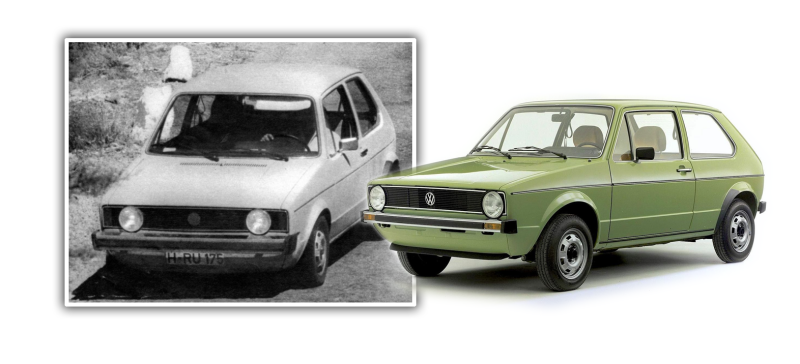
Car design can be a surprisingly subtle undertaking. Little details can have effects far larger than you’d expect, and I think that’s what’s happening here. Early prototypes of the Giugiaro-designed Volkswagen Golf had headlights set in a slightly different location, and, at least to me, it looks and feels dramatically different. It’s astounding how much difference a few inches of positioning can make in auto design.
Maybe I’m nuts, but when I see pictures of that 1970 VW Golf prototype—then called the Blizzard—I can’t help but think it has an incredibly doofy looking face.
All of the same elements are there that would eventually be in the Mk. I Golf/Rabbit, but the headlights were originally set closer together in the rectangular grille.
I think, based on sketches like this, that was done to accomodate turn indicators at the sides of the grille instead of in the bumper:
Advertisement
I’m not exactly sure what motivated the change, but I have my suspicions. For some, likely deep-seated, very biological reason, we as humans find a ‘face’ with closer-set eyes to look…what? Dumber? Younger? Doofier? than one with wide-set eyes.
Here, let’s simplify this down to the basics:
Advertisement
I can’t help but feel it: I might trust that bottom face to, say, go pick up lunch for me, but I wouldn’t send the top one out to get some gum without fear that the fire department may become involved.
As I write this, it seems sort of insane, but I absolutely have that gut feeling. The final Golf, with its wide-set, large headlamp-eyes, looks friendly and capable and competent.
Those Blizzard prototypes look like they’re a minute away from driving over a rake and smashing their radiator.
Advertisement
I suspect most people would agree, though I’m not exactly sure, and that’s part of why I’m writing this at all. Is it just me (and, presumably, Giorgetto Giugiaro) or does anyone else know what I’m talking about here?
Let me know in the comments. I’m also open to discussing theories. I mean, you don’t have anything better to do, right?


