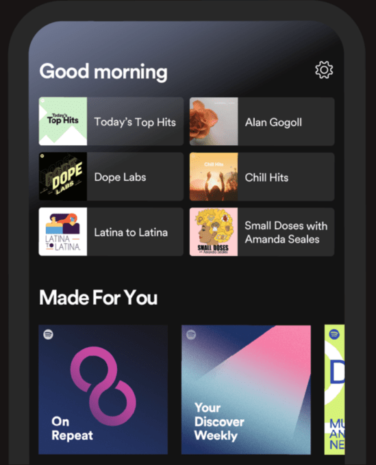
Spotify has been slowly rolling out a redesigned mobile app in small sections — first with an update to podcast pages, then to other parts of the experience. Today, the company is revamping the most critical part of the Spotify app: the home screen. Now, when Spotify users launch the app, they’ll notice the new home screen greets them depending on what time of day it is with a “Good Morning,” “Good Afternoon” or “Good Evening,” for example. But the screen’s content and recommendations will also change with the time of day, Spotify says, and the content has also been better organized so you more easily jump back in or browse recommendations from the main page.
Before, Spotify’s home screen emphasized your listening history by putting at the top of the page things like your “Recently Played,” “Your Top Podcasts” and “Your Heavy Rotation.”
Effectively, the update separates the app’s home screen into two main parts: familiar content on top and new or recommended content on the bottom half.
 Now, the home screen reserves six spots underneath the daily greeting where you can continue with things like the podcast you stream every morning, your workout playlist or the album you’ve been listening to on heavy rotation this week. This content will update as your day progresses to better match your activities and interests, based on prior behavior.
Beneath these six spots, the home page will display other things like your top podcasts, “made for you” playlists, recommendations for new discoveries based on your listening and more.
The concept for the new home screen is similar to what Pandora recently rolled out with its personalized “For You” tab late last year. Like Spotify, Pandora’s tab also customizes the content displayed based on the time of day, in addition to the day of the week and other predictions it can make about a customer’s mood or potential activity, based on prior listening data.
Pandora’s revamp led to double the number of users engaging with the personalized page, compared with the old Browse experience, it says. Spotify, too, is likely hoping to see a similar bump in usage and engagement, as users won’t have to dart around the app as much to find their favorite content or recommendations. That way, they’ll be able to start streaming more quickly after the app is launched, potentially leading to longer sessions and more discovery of new content.
Spotify to date has defined itself by its advanced personalization and recommendation technology, but its app hasn’t always been the easiest to use and navigate — especially in comparison to its top U.S. rival, Apple Music, which favors a simpler and cleaner look-and-feel. Its recent changes have tried to address this problem by making its various parts and pages easier to use.
Spotify says the updated home screen will roll out starting today to all global users with at least 30 days of listening history.


