Of all the Nissan Z cars, arguably two endure the most today: the original 240Z, and the sleek and twin-turbocharged Z32 300ZX of the 1990s. And the designer of that car, Toshio Yamashita, wasn’t just content to design rad cars back in the day. He’s been helping teach the art of car design to the next generation, so he shared the fascinating process he uses to think about car design and brainstorm new cars.
[Full disclosure: Nissan wanted us to check out ZCON—the longest-running Z-car enthusiast gathering in the world—so badly that they threw a couple passes our way and bought us lunch and dinner for the day. There, Yamashita explained his process for sketching up new cars.]
Advertisement
Yamashita’s design credits include everything from being the lead over the Z32 300ZX to helping with the R34 Skyline, 350Z, Infiniti Q45 and even the Nissan Titan pickup.
More recently, he served as a Professor of Transportation Design at Tokyo Metropolitan University, where he researched electric vehicle design that would help keep Tokyo’s environment clean. He also founded his own design company, Interrobang Design.
Yamashita said he originally went to school to become an architect, but his father thought he was too small to be on construction sites and signed Yamashita up for the industrial design program instead. He got his start at Nissan in 1968 in parts design for the A10 Violet, and finally got his big design lead break in April 1984 beginning work on the design of what would become the Z32-generation Nissan Z-car. Yamashita worked as one of two lead designers on the Z32 alongside Isao Sono.
Advertisement
At the time, the Z-car was really important to Nissan’s bottom line and reputation as an automaker, especially in the United States.
Advertisement
“The president of Nissan North America would say to us, ‘Z-car is rice,’” Yamashita recalled. The president referred to rice as Japan’s staple food, not the racist-ish term people have for Asian tuner cars; he meant it as if the Z were a key life-giving food for Nissan itself. “‘Please be careful to design it.’”
The message, Yamashita says, was clear: “Do not fail.”
Birth Of A Kid And Also The Z32
Much like the original 240Z, Yamashita’s design for the 300ZX was a bit of an outlaw design.
Advertisement
Nissan originally wanted designers to submit designs for both the 300ZX as well as the new Silvia (the 240SX in America), but Yamashita broke the rules to submit only a Z-car.
Yamashita says he did his design work on that initial 300ZX proposal at home. He and his wife just had a child, so when she and the baby were away with her parents, Yamashita used his alone time to sketch and perfect the 300ZX.
Advertisement
While new fatherhood is more than enough of its own reason to only be able to fit in one sketch, the 300ZX was the only design Yamashita was truly interested in of the two Nissan wanted.
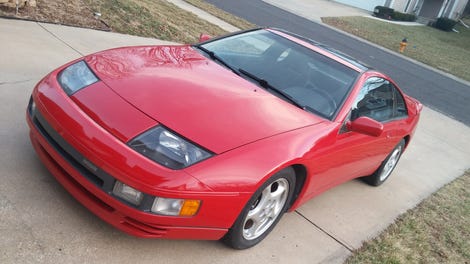
Yamashita stuck his 300ZX onto the board of submitted designs anyway without a Silvia design-mate and it was chosen as the winner. Sleek, elegant and aggressive, it cut a stark contrast against its predecessor, the boxy and angular Z31 300ZX, moving the car out of its thoroughly 1980s looks and into the high-tech and promising 1990s.
Advertisement
Advertisement
From there, the car went from research to creation and then into production.
Yamashita was passionate about making his 300ZX look and feel like a true sports car. He’d been impressed early on by the 240Z, whose prototype sat in the hallway when he first came to Nissan in 1968. He said that pretty sports car made his “heart beat like a train with excitement.”
“First my impression is—whoa,” said Yamashita of the 240Z he’d snuck a peek at, growing wide-eyed as he explained his wonder.
Like the 240Z, the 300ZX was heavily influenced by American car culture. Yamashita visited the United States at the start of the production phase, stopping in California, Dallas, and Detroit to research why the Z was such a big hit in America. What makes a Z-car a Z-car, and what must go into a new one?
First off, the proportions had to get lower and wider to fit the wide-open spaces of the United States that Japan simply didn’t have. Yamashita recalled reworking his sketch at the hotel upon realizing this key difference between the U.S. and his home market in Japan, where streets are much narrower. With an increase in width, the car still had to be low to look proportional, and like a sports car.
Advertisement
Advertisement
Second, more aerodynamic cars were now the main trend. Big Detroit-style muscle cars with folded edges were being replaced by smoother, softer shapes that were seen as more efficient and modern. The land yachts of yore were considered wasteful, and there was a big push to be kinder to the environment.
“I don’t care about the environment [with a sports car], but I work at Nissan, so I have to care about the environment,” Yamashita said in a frank statement about his design.
Advertisement
Good design was good business, though, so the newest Z-car had to be rounded and smooth—even though Yamashita admits that ‘60s muscle cars like Dodge Chargers are among his favorites. He even likened the final rear shape of the Z32 to a piece of corn, and used frameless, smooth side windows to make the design even sleeker.
Yamashita was so adamant about his vision for the Z32 300ZX that Nissan engineers nicknamed him “Mr. Yadashita” (as “Yada” loosely translates into “no no no”) for all the suggestions he shot down.
Advertisement
Advertisement
The headlamps—which were designed with large clear covers as a call back to the original 240Z—were a big point of contention. Engineers asked for easier to a more upright, easier to design set that laid up at a 45-degree angle or that popped up from the front, but Yamashita held firm on his original 60-degree angle spec to maintain the car’s sleek shape.
“I don’t care about mechanics. I care about design,” Yamashita said.
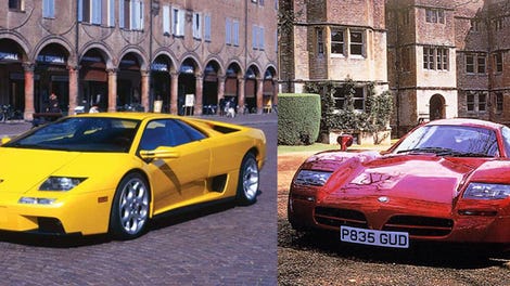
In the end, Yamashita ended up finding very small projectors—a new design for the time—for the engineering team to use. It’s highly unusual for a designer to suggest technology back to the engineering team, but he was adamant about his design. Lamborghini later even used the 300ZX’s headlamps on the updated Diablo. The Z31’s pop-up headlamps, cool as they are, seem hilariously dated in comparison.
That long, low silhouette was paramount to the car’s sporty image, though. The low-angled cabin-forward design made the nose of the car look longer than it really was, despite the fact that its twin-turbo V6 engine was shorter than the original 240Z’s inline six. It also had a longer wheelbase with short overhangs for an elongating effect.
Advertisement
Advertisement
The curved shapes also presented an engineering challenge, but Yamashita was adamant that they keep the shape of the design intact. He said that around 30 prototype windows were rejected in order to protect the shape. Likewise, the antenna had to be re-engineered to be moved from the front fender to the back of the car, where it worked better with the low design.
From sketches, the car went into modelling and then into production. The car launched in June 1989 in the U.S. market and went on to become one of the most celebrated designs in sports car history.
How To Design Your Own Cars
But let’s back up a bit—Yamashita’s biggest contribution to the Z32 wasn’t his refusal to compromise. It was his original idea, sketched out and ultimately chosen for Z-car glory. One of Yamashita’s lasting contributions to automotive design has been his willingness to teach younger designers and enthusiasts what he knows about designing a car, so he walked the attendees at ZCON through an example sketch to demonstrate his thought processes.
Advertisement
Advertisement
Creating tension is key to Yamashita’s design sketches. The pressure and thickness of lines on a sketch are key to showing this tension visually, with a stronger line signifying a darker space in the sketch. The C-pillar of the 300ZX, for example, was especially hard to design as it was fairly thick but still needed to show some visual tension from all angles.
Next, a car needs to have a form in order to make sense. Yamashita combined a circle and a cube as the basis for his example car, the combined shape of which he used as a guide to start drawing the shape of his car in a side view.
He overlaid the sheet of paper with his basic form with another piece of paper to add character lines for the side, roofline and wheel position of the car. Character lines are the creases that give visual interest to the side of a car, under the belt line defined by the bottom of a car’s side windows.
Advertisement
His next sketch was of a quarter view looking at the car from the front left corner, which is an essential intermediary step in his design process. Details like headlamps would come later in the design process, but here is where the sections of the car like doors and hoods were devised. The wheeled shape then starts to be fleshed out into a full car.
Advertisement
After this, Yamashita overlays his quarter view to create a second quarter view where details like intakes and headlamps can be drawn in. You can fill it in with pastels to add color if you’d like, but Yamashita mainly worked in black and white for his example.
Of course, the type of shading used in a sketch can signify not only the shape of each form and where the shadows would fall, but the materials used. It’s easy to tell, for example, lustery chrome versus regular matte shading based on how the lines are filled in using only pencil.
He started adding a dark shadow under the beltline, and then a roof shadow, all of which were carefully blended with his finger, with the lines sharpened further by erasing the excess shading around it with an eraser. Yamashita even cut a piece of paper as a guide for his eraser to clean up the bottom shadow of the car.
Advertisement
Then came the character line shadows on the side of the car, which gave Yamashita’s example a vaguely McLaren 570S-like look to the side. Once again, curves cut out of paper get trimmed into shapes to serve as guides for more shadowing added to the car. Detail gets added to the wheels then, too.
But Yamashita’s sketch was left without filling in the headlights and details. “[It’s not a] new Z, just an experiment,” he clarified.
Advertisement
Advertisement
While computer programs like Photoshop get a lot of use now in car design, Yamashita still prefers to work in pencil.
His old-school method of teaching how a car design comes together has been passed on to some of his former students, some of whom now work for Toyota and Nissan.
He emphasizes having to create the most effective design for the customer of a car above all else. Engineering for cost and the company’s other concerns, he argued, is engineering’s concern. Yamashita works on some packaging concerns, but that’s about all.
Advertisement
Good styling needs to remain a designer’s primary concern, and they should always remember to push back against engineering to encourage the use of newer technologies and other trick solutions to preserve a solid design. Yamashita wants to feel something new in each design, and reflect who he is in his own designs.
Advertisement
After all, can you imagine a 300ZX with pop-ups standing nearly straight up like a Miata’s or a 944’s? I can’t.


