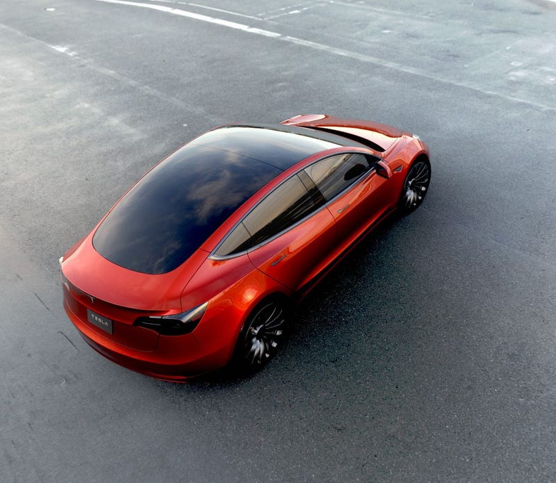
The most anticipated new car of this evening and possibly this year, the Tesla Model 3, is finally here. We’ve seen it. And, almost immediately upon seeing it, we’re judging it. Here’s my design breakdown based on what we’ve seen so far.
http://jalopnik.com/tesla-model-3-…
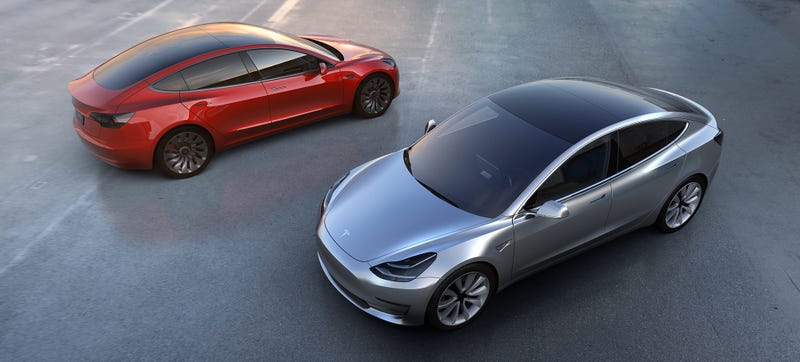
Overall, I think it’s a really strong design. Tesla has established a pretty crisp and coherent design vocabulary with the Model S and Model X, and the Model 3 is a pretty clear development of those basic ideas.
Advertisement
The most obvious part of the car that shows evolution of the Tesla design vocabulary (and also likely the most controversial part of the car) is right up front, where the grille is noted for its absence.
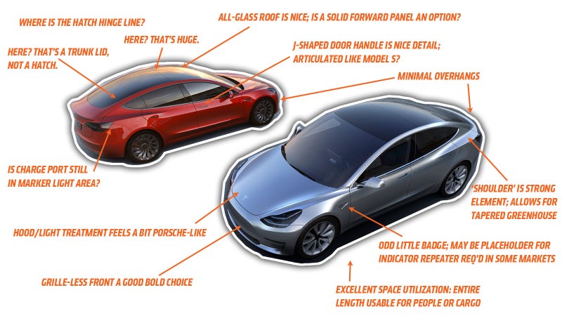
Electric cars have very different cooling needs than combustion cars, and don’t require the same large cooling air/manifold air intakes. The Model S, the first all-Tesla design, still felt compelled to hold a spot where a grille would traditionally go, with its large, grille-like glossy black panel.
Sponsored
The Model X reduced this vestigial grille-like feature to a small horizontal decoration, and finally Tesla has stepped up to the reality of their cars and is boldly going face-grille free with the Model 3.
There’s still a lower, below bumper-line air intake, but the traditional grille spot is now just a clean, sleek painted surface, with a sharp character line sort of defining the area where our anthropomorphizing brains want to see a mouth.
This design challenge has been tackled many times before by rear-engine (especially air-cooled) car makers, and the Model 3 has, I think, an uncanny resemblance to a modernized Renault Caravelle, which had its engine in the rear. Here, look:
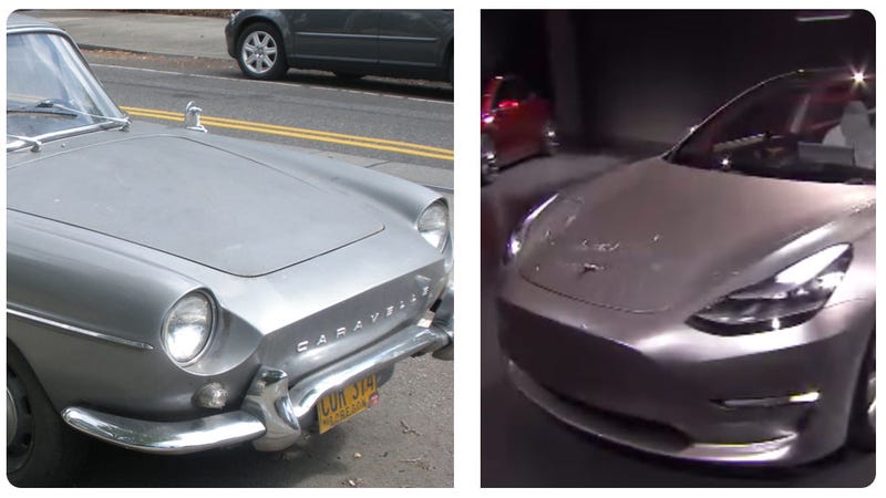
Look at that forward rake, that character line in the front, the line of the hood trunk opening, the bumper position; if Renault showed this as a reborn Caravelle, I would have totally been on board.
Advertisement
That said, there’s a bit of Porsche-family resemblance in the front end, likely the product of convergent evolution since Porsche design vocabulary was based on the grille-less rear-engined front ends of the 356 and then the 911; hood and headlight relationships really do feel Porsche-like here.
Like the Model S, it has fantastic packaging, where the entire length of the car is usable for people or cargo. Tesla says it has way more room and cargo space than an engine-powered car of the same size.
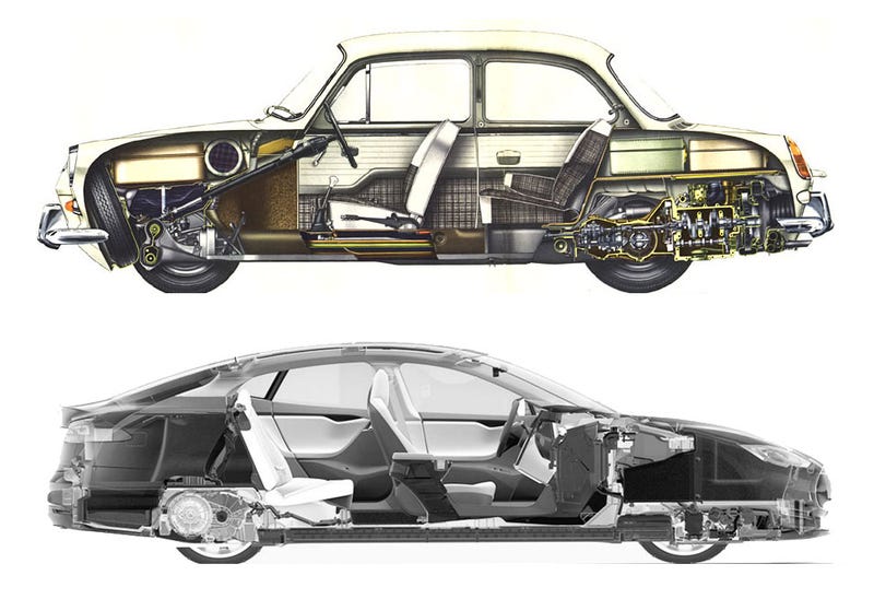
The Model 3 has a front trunk and a rear hatch, with its engine (and batteries) built into the floor pan, on Tesla’s ‘skateboard,’ making it the modern spiritual successor to the VW Type 3 platform.
The Model 3 is sleek and clean and quite modern-looking. The short overhangs make it a bit less languidly elegant than a Model S, but the proportions are still quite good. The side window line kicks up pleasingly at the rear, without feeling too forced, and the greenhouse’s overall taper I suspect has aero benefits, but also gives the car a leaner overall look, and forms the ‘shoulders’ or ‘haunches’ at the rear that suggest a bit of animal-like musculature, a hint at the rear-wheel drive nature of the car.
I’m a little confused as to where the rear hatch opens; I can only see two cutlines, one really high (where the rear window glass meets the short roof glass (other non-glass options?) panel on top of the car, which would make an absurdly huge hatch, and one really low, which would make more of a trunk lid than a hatch. I guess we’ll have to see what opens.
The proportions of the wheels look good to me, and I’m glad Tesla resisted the temptation to oversize them too much.
My biggest complaint is probably that when you look at the car at certain angles, like this one:
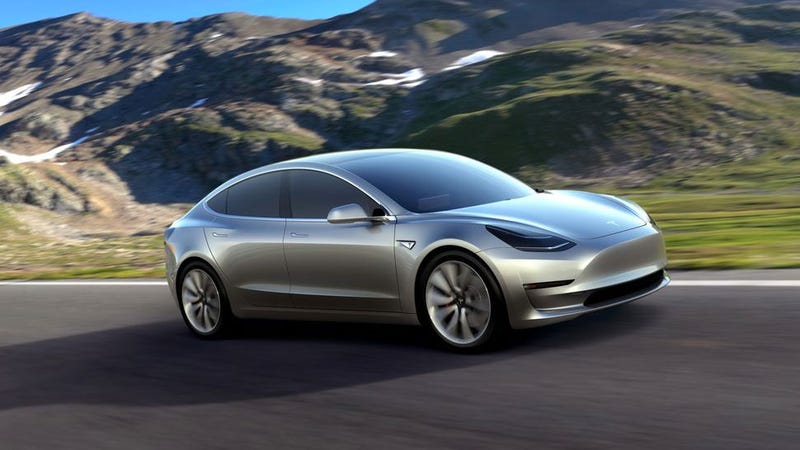
It sort of has a slightly ghostly, unfinished quality. That lack of a grille that I championed a few paragraphs up can have the unsettling effect, combined with the overall clean, unadorned look of the car, where the car feels like it’s still covered by a silken sheet, or something.
I don’t exactly dislike it, but it does lend it the feeling of a sketch, or something like how objects might look to Daredevil, at least based on the dripped-wax effect of the opening credits:
See what I mean?
Overall, I do like the design, and think that it rides the line of being conventional enough for people to accept, while feeling just different and futuristic enough to get people excited and interested. There’s a lot of unbroken surface area here, so colors will be important, more so than on many conventional cars, and I hope Tesla makes equally bold choices here.
I’m excited to see one in person and really evaluate it, and get a peek at the interior, which so far all I can tell is it’s a huge tablet stuck to a dash.
I’ll get more details, and more qualified opinions as soon as I’m able.
