I was really excited when the first modern-era smartwatches were announced a few years ago. Google had just introduced Android Wear and there was non-stop buzz surrounding Apple’s smartwatch. This was supposed to be the next big thing, but it turned out that there wasn’t much to smartwatches.
Somewhere between the first generation and the present options, manufacturers discovered there’s not much you can do with a 42mm display and they decided to scale back expectations. This is the climate that Mobvoi decided to launch its Ticwatch 2, its second smartwatch, into.
Mobvoi is a Chinese company that first jumped into the smartwatch game last year with the Ticwatch. It was a jump that was measured and limited, testing the waters of the smartwatch market. The Ticwatch only debuted in China with tepid expectations, but the follow-up is aiming for a global launch and a much bigger impact.
This begs the questions: How does the Ticwatch 2 compare to the Apple Watch and Android Wear devices? Surprisingly well, actually.
The Ticwatch 2 is a simple device to use, with an easier learning curb than the Apple Watch and Android Wear alternatives. From the home screen to the pairing process, Ticwear made sure this wasn’t an overly complicated device.
Pairing the Ticwatch 2 to a smartphone is simple enough. You just need to download the Ticwear app and create an account. This part turned out to be the most tedious. In my experience to log in, I typed in three different email accounts yet none were able to create an account. I wasn’t able to create an account until I logged in with my Google account. You can also use a Facebook account.
Once your account is set, the app is going to want to pair with the smartwatch and you do this by bringing up the QR code on the watch, and the process is complete.
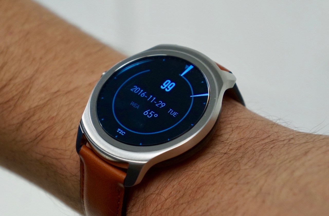
The hardware is also similar to other smartwatches. It has a circular design like the Moto 360, but it managed to eliminate the bottom “flat tire” for a complete circle display—a much-welcomed design. That’s where its advantages over the 360 end though.
The steel casing looks similar to the 360, but doesn’t look or feel as good. The bottom compartment that houses the heart sensor is plastic instead of the glass on the Moto 360 or Apple Watch. The leather bands that came with the watch are not anything you’ll brag about, a far cry from the Horwean Leather that comes with the Moto 360.
But even for all of its hardware deficiencies, I was able to forgive the watch due to its $199 price tag. This is where Ticwear hopes to undercut the market, but we’ll get to that later.
The biggest differentiating factor that sets the Ticwatch 2 apart from other smartwatches is its software. Instead of running Android Wear, Mobvoi chose an optimize version of Android (5.1) and use its own skin on top of it, called Ticwear 4.0. This makes the performance much smoother and less clunky like what I experienced on a daily basis with the Moto 360.
The main goal of Ticwear 4.0 is to simplify the user experience. This simplicity comes down to one thing: notifications. That is all the Ticwatch 2 is good for, but that’s not necessarily a bad thing. There is inherent gain when you understand your limitations, and Mobvoi understands that replying to a text on a tiny display isn’t the best use of your time. So you can’t do it. This device just delivers notifications, and nothing more.
Ticwear 4.0 runs best with optimized hardware due to the gesture-based Cubic UI it utilizes. The trick Mobvoi has up its sleeve is the Tickle dial; a touch-based way to scroll through the device without the use of a physical dial. The unfortunate name doesn’t give it enough credit. The Tickle dial is really an intuitive feature with its unobtrusive design. Aside from the name, this feels a lot like the dial the Apple Watch should have had—a dial that’s optional when used and invisible when ignored.
On the spec side of things, the Ticwear 2 features a 400 x 400-pixel OLED display (287 ppi) that is vibrant and rich. It doesn’t look a good as the Apple Watch display, but it’s on a par with most Android Wear devices. Its 300mAh battery sounds impressive, but doesn’t get the battery life you’d expect. It was good enough to last through a whole day, but barely. I’d get home with about 15% left. That was particularly disappointing given that it isn’t as rich in usability as other smartwatches, but that isn’t shown in its battery life. The design is also IP65 rated, meaning it’ll be able to handle random dips in the pool.
The Ticwear 2 works with iOS and Android, but unlike Android Wear, it actually works properly on an iPhone. All of my iPhone notifications – Mail, Messages, third party apps – came through without a hitch. I was actually surprised by how well it played with iOS, but that probably goes back to the fact it focuses mostly on notifications instead of core operating system integration.
So the question now is, should you buy this smartwatch? Absolutely. The Ticwatch 2 offers a great smartwatch experience that rivals its competition at a fraction of the cost. It hangs with Apple Watch and the like, even though it doesn’t quite surpass its versatility. Coming in at $199, it’s well below the Apple Watch Series 2 starting price of $369.
You can get your hands on an Apple Watch Series 1 with improved processor for $269, but that’s also more expensive and aside from the improved processor, every other spec is dated. A more comparable watch is the Moto 360 Sport for $199. The differentiating factor is that Ticwear 4.0 is a much more usable and enjoyable watch experience than on Android Wear.
This might be my personal experience, but even as much as I enjoyed the look of the Moto 360, the software on the Ticwatch 2 made it a much more usable smartwatch. I don’t need to respond to texts and do long division on my smartwatch. I just need it to let me know when I get a Slack notification or let me know how the weather is. And for $199, the Ticwatch 2 does exactly that.
If you’re looking to get into the smartwatch game while saving some extra bucks, you won’t go wrong with the Ticwatch 2. Its ambition was never quite as lofty the Apple Watch or Android Wear and that makes it endearing. It’s a simple take on the smartwatch that I found it thoroughly refreshing .


