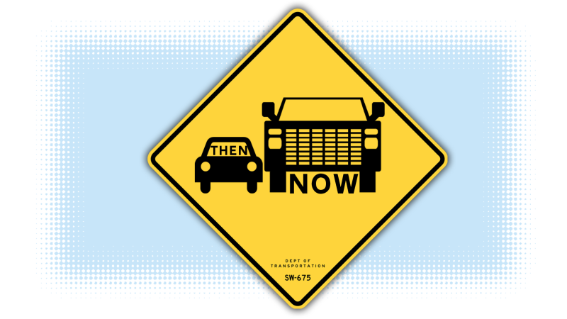
It’s pretty well known now that sedans—the once-default, three-box design for a passenger car—are rapidly fallingout of favor, especially in America. While the ratio of sedans on American roads is diluting every day, the iconic sedan shape is still the default icon for the generic idea of “car” on most official and unofficial signage. Maybe it’s time for a change, to reflect reality a bit better? If so, what would that look like?
If we’re going by what people tend to be buying, then it’s looking like the default passenger vehicle icon should be some sort of large SUV or truck. We don’t have to like it, but we may as well accept it, and start incorporating this new reality into our street signs.
With that in mind, I made some modified signs with the new, updated iconography to consider.
Advertisement
Advertisement
A far better reflection of our giant SUV present and future. Local municipalities, I’ll be waiting by my phone for your call.


