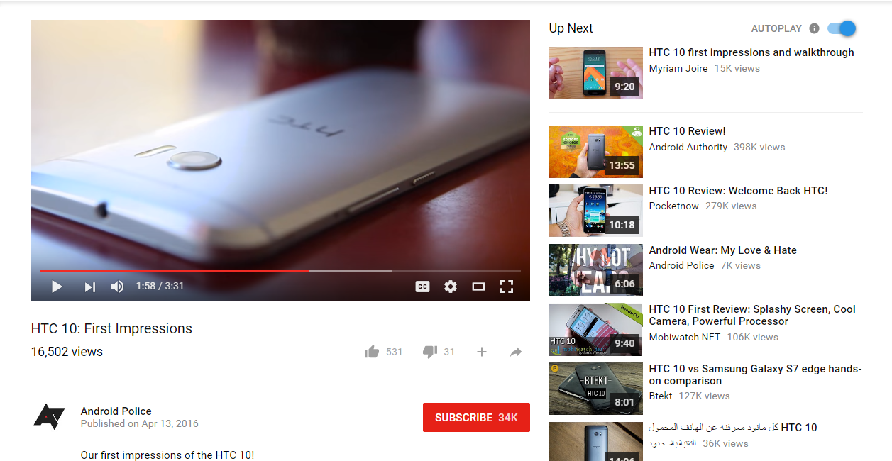
YouTube is testing a brand new interface for the web that takes cues from Google’s Material Design guidelines for Android. It comes two months after Google began testing a similar facelift for Chrome on desktops.
As you can see in the screenshots above, which were published by Android Police, the new YouTube looks a lot like an Android app. It has a cleaner, more modern font; flatter buttons and other interface elements, and an improved layout for many pages.
Like Chrome on Android, YouTube’s search bar and other elements change color to match the scheme of the channel you’re visiting. “This really gives you the sense that you’re not on just another YouTube page, but this channel’s YouTube page,” Android Police reports.
You probably can’t see the new look yet, because only a small number of users have gotten it while it’s still in testing. There’s no word on when it might rollout to all, either. But you can activate the redesign yourself by following the steps below.
- Go to https:www.youtube.com/?gl=US
- Open the developer tools (ctrl + shift + i)
- Go to the `Resources´ tab and delete the VISITOR_INFO1_LIVE cookie for the youtube domain
- Go to the console and define the VISITOR_INFO1_LIVE cookie using the following command:
document.cookie="VISITOR_INFO1_LIVE=Qa1hUZu3gtk;path=/;domain=.youtube.com"; - Reload the page
It should be noted that you have no choice but to set your region to the U.S. for this to work, and even after performing these steps, the new look may not appear in all browsers. Bear in mind that your mileage may vary.
If you have been able to activate YouTube’s new look successfully, let us know what you think about it in the comments down below.

